“We’re open on the product. We just need 1,200 pieces with our logo for an October conference.”
The buyer had already pulled three possibilities from a catalog: a spinner, a silicone popper and a small desk cube. Her logo was attached to the email. It was wide, with a symbol on the left, the company name beside it and a tagline underneath.
On a computer screen, there was no obvious problem. On the actual samples, there was hardly anywhere to put it.
That is the awkward part of branded fidget toys. The product is small, and nearly every interesting surface is there for a finger to press, turn or cover. A logo can fit neatly on a digital proof and still be a poor choice once somebody starts using the item.
Table of Contents
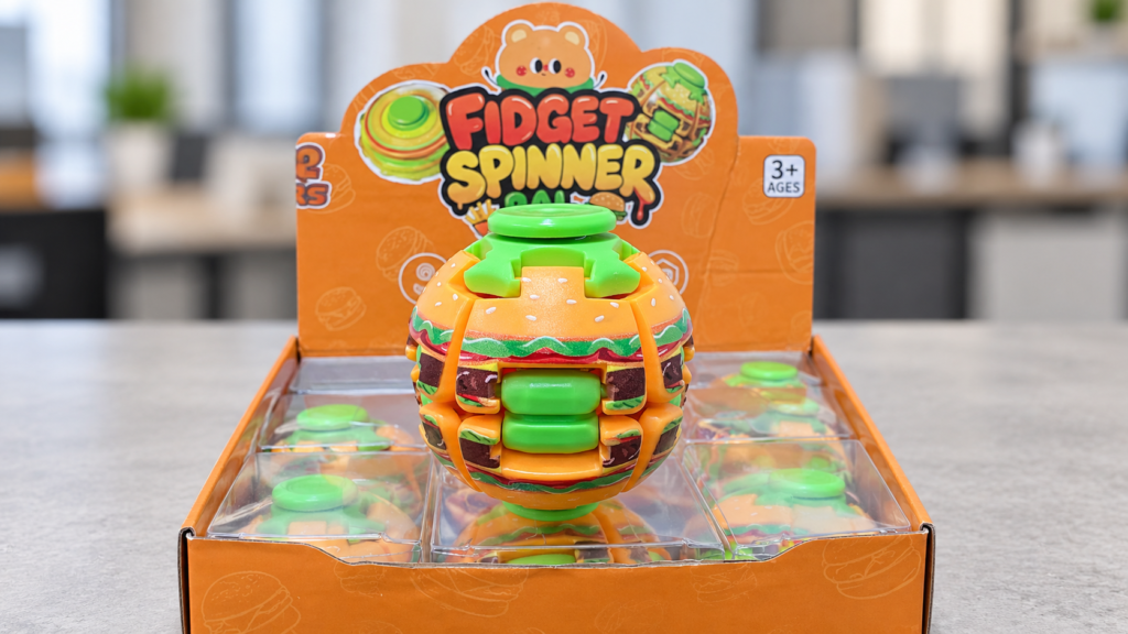
The Spinner Settled One Question Quickly
Marketing wanted the full company name on one of the spinner arms. It looked good while the sample was sitting on the table.
Then someone spun it.
The name disappeared immediately. Even when the spinner stopped, the arm was where people naturally held the product. The center cap offered much less room, but at least the mark stayed visible.
Fortunately, the company had a standalone icon in its brand files. That icon went on the cap. Nothing else did.
This was not the compromise the buyer had expected, but it looked cleaner than the full logo squeezed into a space that could not support it. The company name, event line and website moved to the backing card.
Branded fidget toys often work better when the product and package divide the branding job. The product carries the quick identifier. The package handles everything that requires reading.
Why Branded Fidget Toys Need a Hands-On Proof
The silicone popper created a different argument.
Its face was larger than the spinner, so it seemed like the natural place for the full logo. The problem was that the large area was made almost entirely of bubbles. They bent, inverted and sat directly under the user’s fingertips.
The supplier could probably put ink there. Nobody in the review was convinced that meant they should.
A new sample may photograph well before it has been touched. What the buyer wanted to know was how the print would look after a few days in someone’s bag or on a desk. Would it stretch with the bubble? Would the edge begin to lift? Would the user spend all day rubbing the same part of the artwork?
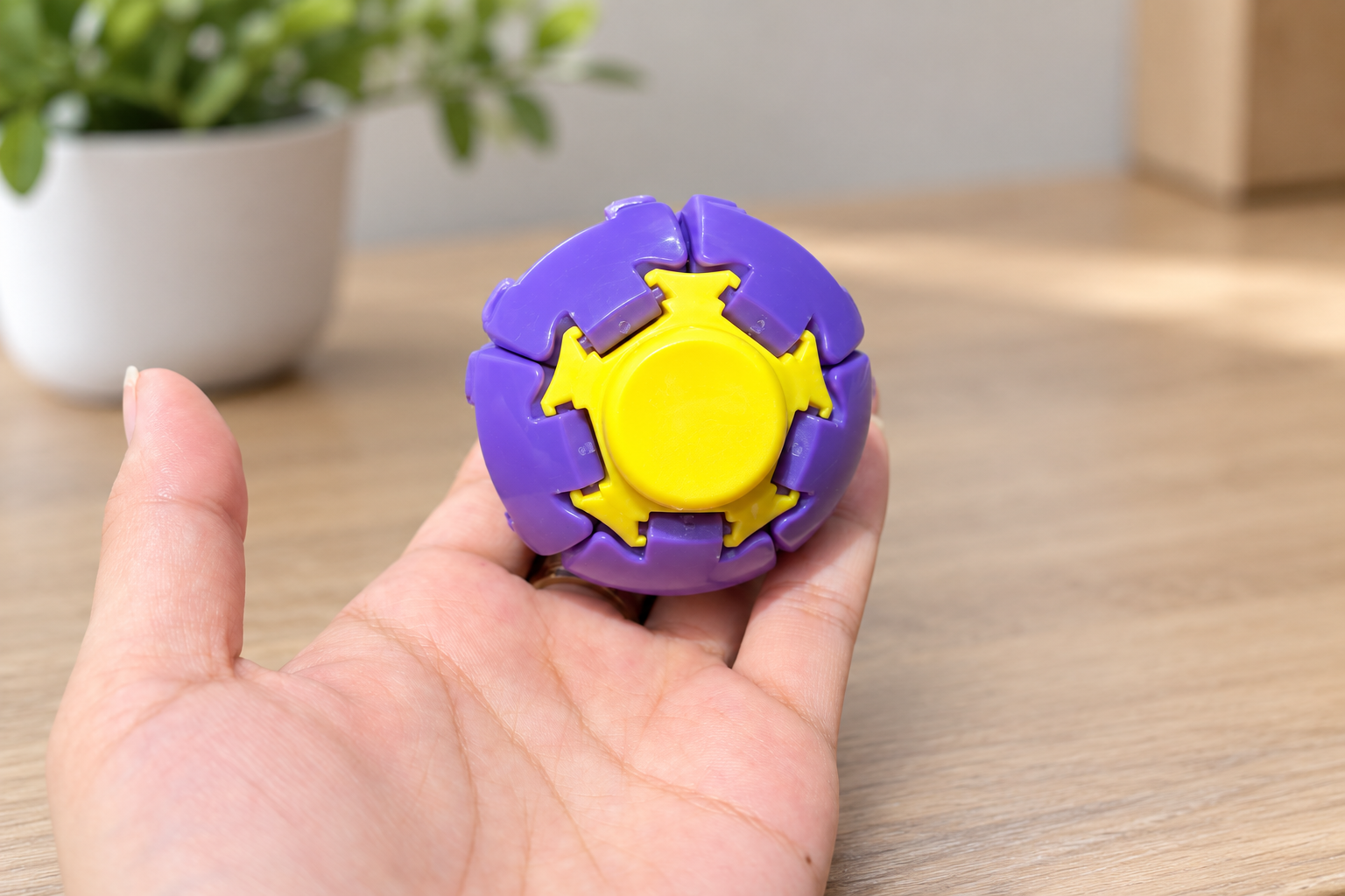
Those questions could not be answered by enlarging the virtual proof.
The popper had a narrow, firmer border. A short web address could fit there, but the company name could not. They tried it anyway. The result looked like fine print, which was not what anyone wanted from a promotional product.
The popper was dropped from the order.
That is a perfectly reasonable outcome from a sample review. Not every product has to be forced into the program simply because it appeared in the first quote.
The Cube Looked Easy Until the Copy Arrived
The desk cube had flat faces. Compared with the popper, it looked almost generous.
The buyer initially wanted the short wordmark on one side. Then marketing proposed putting one word on each face so the message would reveal itself as the cube turned.
Now the supplier needed more than a logo file.
The button side was not interchangeable with the roller side. The switch had a natural upright direction. One word appeared upside down in the first assembled view even though every individual print file looked correct.
The correction was simple because it happened during sampling. The proof was labeled by actual face—button, switch, roller, top and bottom—and the buyer approved photographs of the assembled cube.
For branded fidget toys with several controls, that assembled view matters. A proof showing five separate rectangles does not tell the buyer what those rectangles will look like once they become one product.
It also helps prevent the sort of production note that sounds clear until two people read it differently: “Print on the front and right side.” A cube does not necessarily have a front until someone defines it.
Nobody Needed to Pick a Printing Process First
At one point, the buyer asked whether UV printing would look more premium than pad printing.
It was the wrong question, although an understandable one.
The product material and print location had to come first. A rigid center cap, a metal component and a flexible silicone bubble do not present the same decorating job. Pad printing can be useful for small or irregular plastic surfaces. Screen printing generally needs a flatter area. Laser engraving may suit certain metal parts. None is automatically the premium answer.
The supplier already had a regular setup for printing the spinner cap. Using it reduced uncertainty. The cube required a separate fixture and an assembled-sample check because the orientation mattered.
That was enough information for the buyer. She did not need a tour of every printing machine in the factory.
What she did need was the usable print size. Not the approximate product dimensions—the actual area the factory could decorate cleanly.
The icon on the spinner was reviewed at actual size. It looked small on the monitor and appropriate on the product. That distinction is easy to miss when every proof is viewed at 200 percent.
Packaging Finished the Job
The final order was 800 spinners and 400 cubes.
The spinner carried the company icon. The cube used the short wordmark on one face. Both went onto the same full-color backing card with the complete logo, conference message and QR code.
Side by side, the products looked related even though their shapes and imprint methods were different. The card created that consistency.
It also solved the QR-code problem. Nobody had to hold a spinner still, find a tiny code and persuade a phone to scan it from a curved or moving surface.
Packaging was not an afterthought here. It was the part with enough room to communicate.
A quote for branded fidget toys should therefore cover more than the unit and imprint. For this project, the final request included the two selected products, 1,200 total pieces, both approved logo files, the backing-card artwork, the October arrival date and the destination ZIP code.
The buyer also asked for three things before production: actual imprint dimensions, decorated samples and photographs of the assembled products. Those checks were more useful than specifying a printing technology in the first email.
If the finished item will be marketed as a children’s toy, the review also has to go beyond appearance. Age grading, materials, coatings, construction and the final decorated configuration affect which U.S. requirements apply. A report for a similar-looking version should not be assumed to cover every customization.
Good branded fidget toys are not the ones with the most artwork squeezed onto them. They are the ones where the branding still makes sense after the product leaves the proof sheet and lands in somebody’s hand.
Vilora Toys works with promotional distributors, brands and wholesale buyers on custom fidget, squishy and novelty toy programs. Send the product reference, logo files, quantity, packaging plan, required arrival date and destination ZIP code when requesting a quote.
Read More
• Press-to-Spin Fidget Toys: From Prototype to Product Line