
“Cream at the bottom, pink at the top” sounds like a clear instruction.
One sample arrives with a small pink blush near the crown. Another has a pink upper half. Both follow the description, but only one may resemble the product the buyer imagined.
Gradient squishy toy painting requires more than two color references. The brief also needs to explain where each color belongs and how gradually they should blend.
This guide focuses on sprayed surface decoration. A multicolor appearance alone does not establish how a toy was colored; confirm the proposed process before writing the decoration brief.
Table of Contents
Specify the Fade, Not Just the Two Colors
Imagine a peach-shaped squishy with a cream body and pink shading.
A narrow transition can create a concentrated blush. A broad transition can spread a faint pink tint across most of the body. Even when the strongest pink matches the same reference, the finished products can look quite different.
For gradient squishy toy painting, distinguish the main color areas from the space where they blend. Decide which color should dominate, where the accent should be strongest, and how far the fade should extend.
Iwata’s airbrush basics explains how atomized paint can produce blended effects and gradients. The equipment makes a soft transition possible; the design brief still has to describe its location.
A useful instruction might read:
Keep most of the body cream. Concentrate the pink around the crown and fade it gradually toward the middle. Leave the lower body cream rather than covering the entire surface with a pale pink tint.
This is an illustrative design note, not a production tolerance. It gives the development team a clearer starting point than “make the gradient softer.”
For gradient squishy toy painting, an annotated front view can mark the darkest area and the approximate end of the fade. The physical sample then shows whether that transition looks right on the finished surface.
Use the color matching guide for the separate task of agreeing on the shades.
Follow the Color Around the Whole Shape
A front illustration can leave most of a three-dimensional product undecided.
Should the pink continue around the back? Does the fade end at the same height on both sides? Should an ear receive the accent color or remain cream?
For gradient squishy toy painting, describe the layout using features the production team can locate. “Fade to cream below the ears” is easier to interpret than “keep the top fairly pink.”
Vilora’s Unicorn Squishy Toy illustrates the placement questions raised by a character shape. The body, mane, horn, and facial details form separate areas. The product is a shape reference here, not confirmation of a particular gradient process.
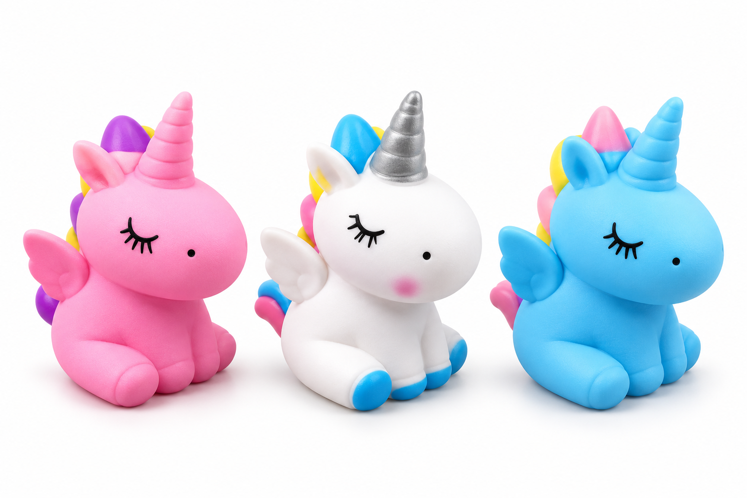
On a proposed custom version, specify whether the body fade continues onto those features. A gradient that stops at the neck creates a different effect from one that carries through the head.
Check curved areas from more than one angle. A darker patch beneath an ear may be a shadow rather than painted shading. Turning the sample under consistent lighting helps separate the two.
Review gradient squishy toy painting from the front, sides, and back so the color layout remains intentional as shoppers turn the product in their hands.
Keep the Face Clear of the Fade
A soft blend can still interfere with a character’s expression.
If dark shading reaches the eyes, their outlines may become less distinct. Pink spreading over already pink cheeks may make those details disappear. A pale muzzle may lose its shape when the surrounding color extends too far inward.
When planning gradient squishy toy painting, identify which facial areas should remain in the base color. Mark the eyes, mouth, cheeks, or muzzle individually where necessary.
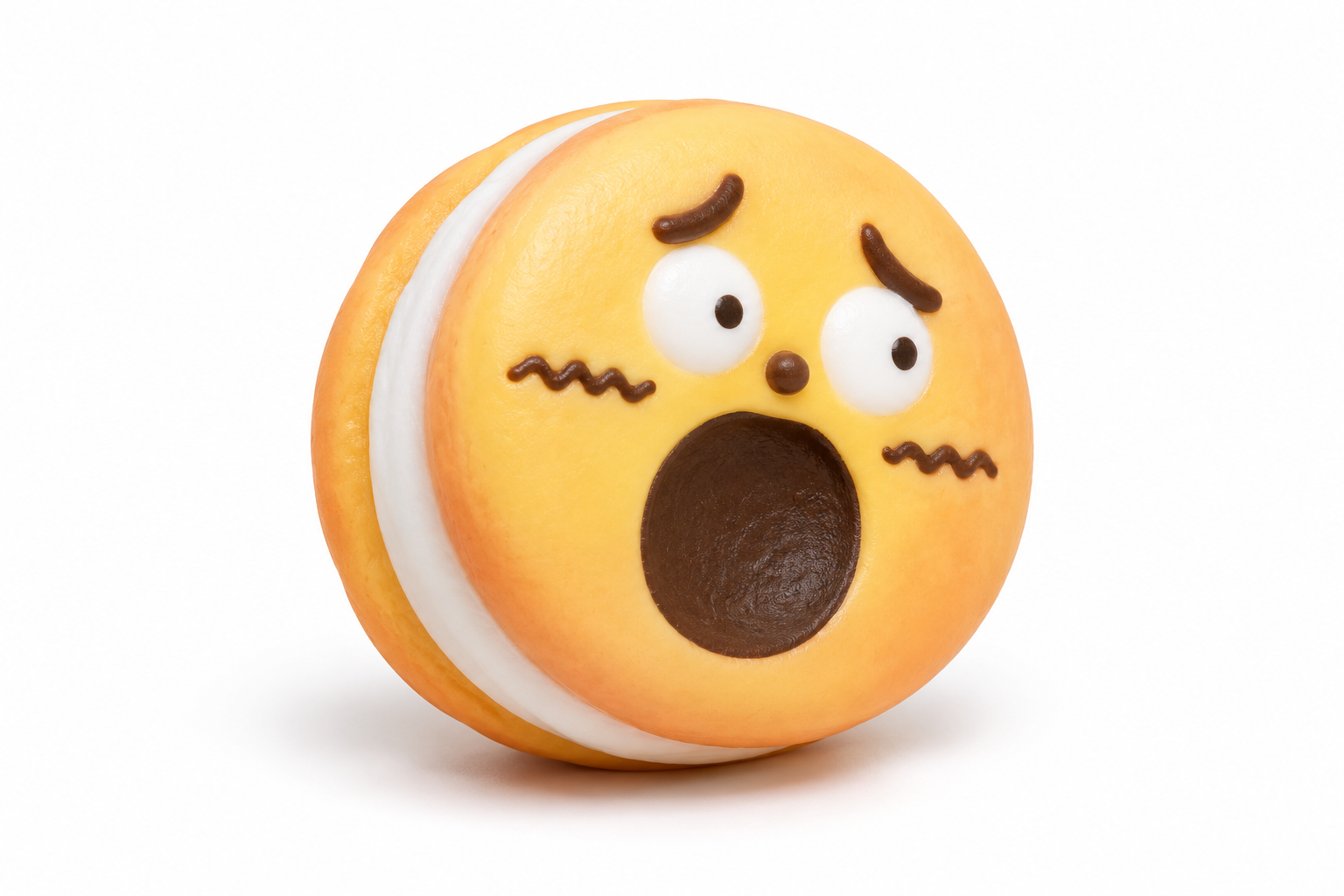
The boundary does not always need a sharp edge. A gradual fade can stop short of the face while preserving the intended softness. What matters is whether the expression remains clear at the product’s actual size.
Compare two kinds of variation separately: a slightly wider blend on the back and unwanted color across the mouth. The first may leave the approved appearance intact; the second may change the character.
The supplier should also confirm that the decoration method suits the finished material. Createx’s technical resources distinguish application guidance for different surfaces, including flexible substrates. They do not establish that a particular paint system is suitable for every squishy toy.
Successful gradient squishy toy painting keeps the main color, accent, and facial details in balance. A useful revision request names the area that needs changing: “reduce the pink around the eyes” gives the production team something specific to adjust.
Read More