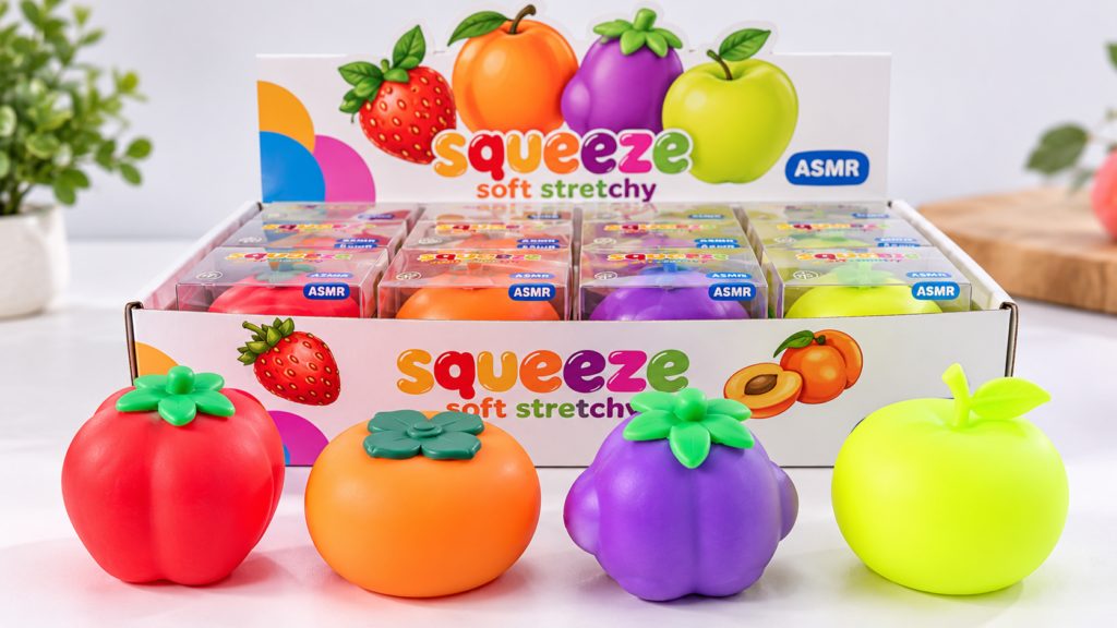
A retailer approves a soft lavender squishy in March. The first shipment looks right. Three months later, the reorder arrives with a noticeably cooler purple. The product is still recognizable, but next to the original stock, the difference is hard to miss.
For private-label brands, squishy toy color matching isn’t just about choosing attractive shades. It’s about making sure the color approved during development can be reproduced when the same product is manufactured again.
That requires more than sending a Pantone number to the factory.
Table of Contents
Start With a Color Reference, Not a Screenshot
Screenshots are convenient for discussing ideas, but they aren’t reliable production standards. A pale pink on one laptop may appear warmer or brighter on another.
A physical color reference gives both sides a clearer starting point.
Pantone provides standardized color systems used across design and manufacturing. Its color systems guide explains how shared references help manufacturers communicate color requirements.
Still, a printed color chip is not the same as a finished squishy toy.
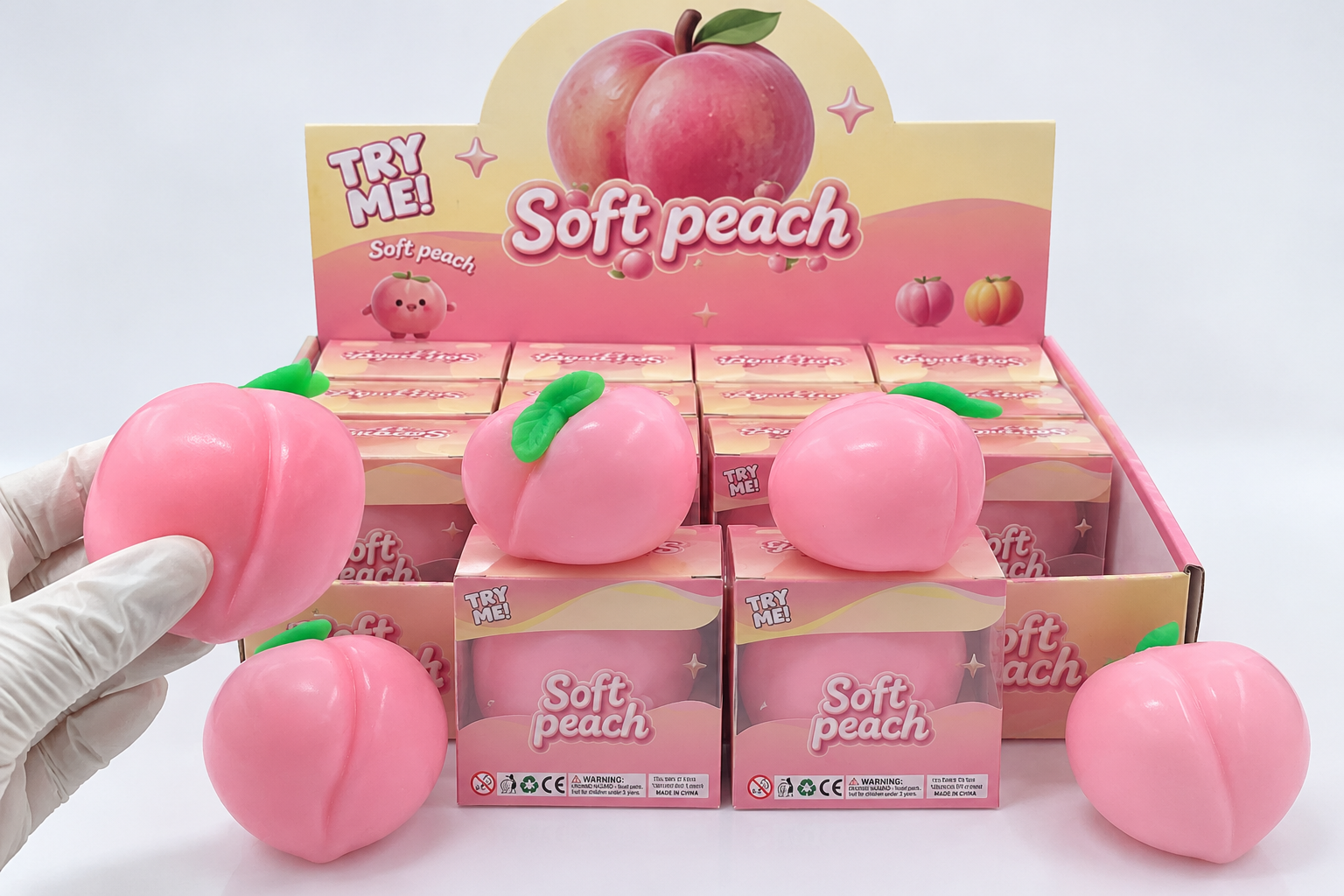
The surface material, transparency, finish and pigment formulation can affect how a color appears. A shade that looks perfect on paper may need adjustment when produced in a flexible toy material.
For squishy toy color matching, buyers should specify the target color and then approve how that color actually looks on the product.
Match the Finished Toy, Not Just the Pigment
A single toy may contain several visually distinct parts: the main body, painted cheeks, printed eyes and an attached decorative element.
Those components may use different coloring processes. Matching them isn’t necessarily as simple as applying the same formula everywhere.
Consider a character squishy with a peach-colored body and pink facial details. If the body is made in a tinted material while the cheeks are surface-decorated, the two colors may respond differently to light and surface texture.
This matters even more with transparent or translucent products, where the material beneath the surface can influence the final appearance.
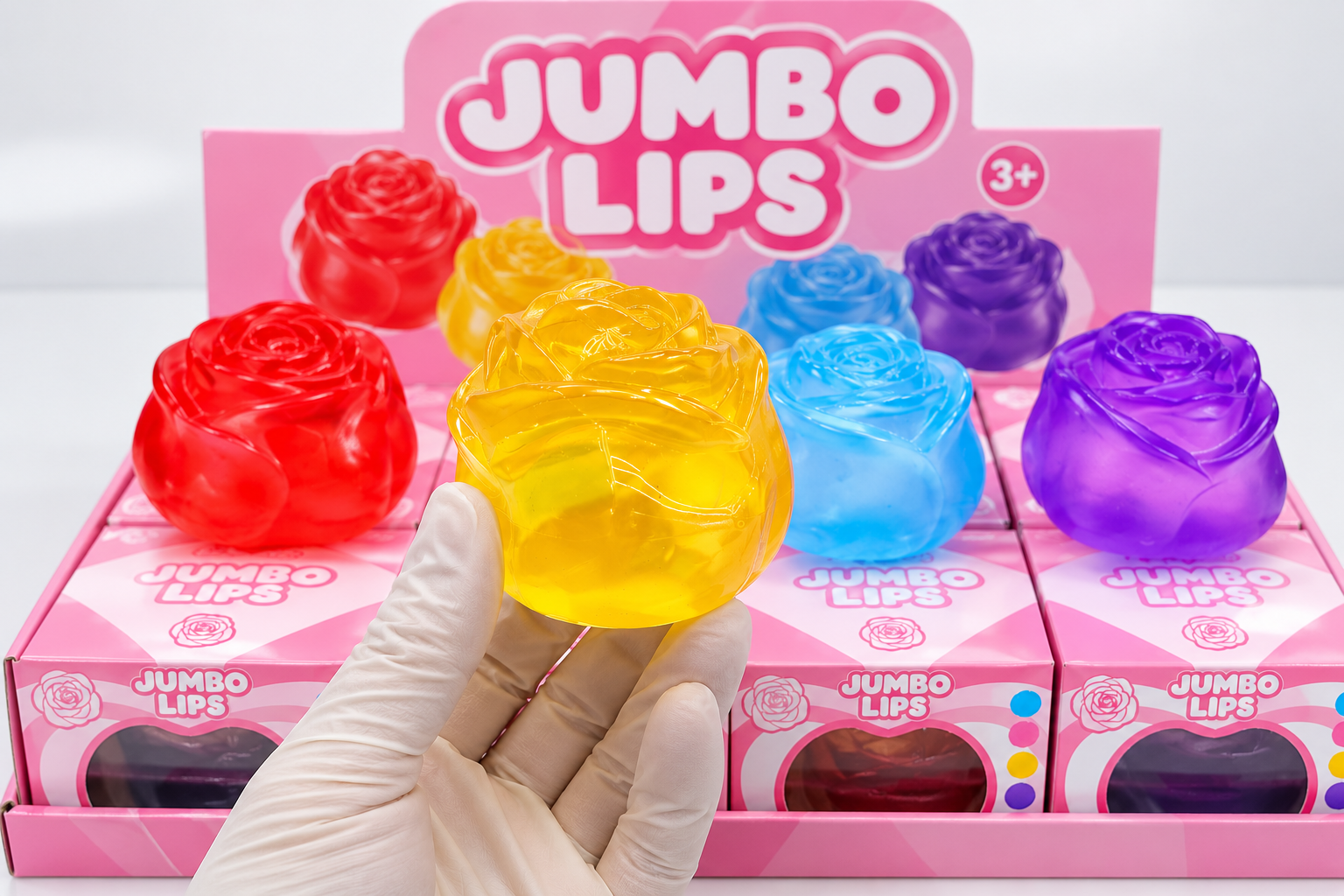
When reviewing squishy toy color matching, ask the manufacturer to identify which colors belong to the molded body, which are printed or painted, and which come from separate components.
Buyers can use the broader custom toy colors guide when deciding which color variations belong in a product line. At the approval stage, however, each production method needs its own reference.
Review Samples Under Consistent Lighting
A color can appear correct near a sunny window and noticeably different under warm indoor lighting.
That doesn’t necessarily mean the product has changed.
Pantone’s lighting guidance explains why controlled illumination matters when comparing colors across materials.
For buyers without professional color-evaluation equipment, consistency is still possible. Compare the approved sample and the new sample side by side, under the same lighting, against a neutral background.
Avoid comparing one sample photographed in a factory with another photographed in an office.
A useful review includes the front, back and decorated areas. If the product has a transparent shell, examine it both empty of background distractions and against the intended retail packaging.
For squishy toy color matching, physical samples should take priority over phone images when color accuracy is commercially important.
Keep a Master Sample for Every Approved Color
An approval message saying “purple looks good” won’t help much when a buyer reorders six months later.
A better approach is to identify the approved physical sample as the master reference.
Record the SKU, color name or code, approval date and sample version. If a product has several approved colors, each should have a clearly identified reference.
| Approval record | What to confirm |
|---|---|
| Product and SKU | Exact design and size |
| Color reference | Pantone code or approved color description |
| Master sample | Physical sample and approval version |
| Decoration | Separate references for printed or painted details |
| Comparison conditions | Agreed lighting and acceptable variation |
| Reorder reference | Previous approved production version |
This is particularly useful when a brand offers multiple shades that are intentionally close together.
The goal isn’t to promise that every manufactured piece will be visually identical. It’s to establish what acceptable production variation means before the order is made.
Check the First Run and Every Reorder
Even with a master sample, squishy toy color matching needs attention when production starts.
Ask for representative samples from the initial production run, not only the earlier development sample. Compare the actual finished products with the approved reference before the order is packed.
If the factory identifies a material, pigment or process change, the buyer should be told before the change is treated as approved.
Reorders deserve the same discipline. A familiar SKU can still vary when raw materials, suppliers or production conditions change.
This is where color approval connects with squishy toy inspection. Inspectors need a physical reference and clear instructions about which differences are acceptable.
A product may pass a general appearance check yet still be unsuitable for a retailer that needs the new stock to sit beside an earlier batch.
For private-label buyers, reliable color consistency comes from a simple habit: approve the finished shade, document it carefully, and compare future production against the same standard.
Good squishy toy color matching protects more than appearance. It helps a brand maintain a recognizable product line from its first order through the next replenishment.
Read More