Choosing custom toy colors sounds like one of the easier parts of product development. Pick a reference, send it to the manufacturer and approve the sample.
Physical products make that process less predictable.
The same color can appear different on a soft matte surface, a glossy molded part or a translucent material. Glitter and pearlescent effects introduce another layer because the appearance changes as light moves across the product. Even two samples that look similar in one room may separate under another light source.
For toy buyers, the goal is therefore not simply to choose attractive colors. It is to define what is actually being approved—and under what conditions.
Table of Contents
A Color Reference Is a Starting Point, Not the Finished Toy
A Pantone reference gives the buyer and manufacturer a much better starting point than saying “bright pink” or sending a screenshot.
But a reference number does not make every physical material look identical.
Pantone itself maintains different color systems because materials and applications behave differently. It also notes that the appearance of color can change depending on the material and that some colors may not be achievable on particular materials.
That distinction matters when developing toys.
Imagine a product with a colored soft body, a printed face and a printed retail box. Even if the buyer wants all three to share the same brand color, the color is being reproduced through different materials and processes.
The better development question is not:
“Did we use the same color number?”
It is:
“Do these parts look appropriately matched on the finished product?”
For commercially important colors, a physical reference can also be more useful than judging from a computer screen. Screens emit light; physical products reflect it. What looks right in a digital rendering should not automatically become the final production standard.
How Material Changes Custom Toy Colors
The base material underneath a color matters.
An opaque toy body can hide what is underneath and produce a more solid visual result. A translucent material intentionally allows light to travel through it, so depth, thickness and whatever is inside the toy can influence what the shopper sees.
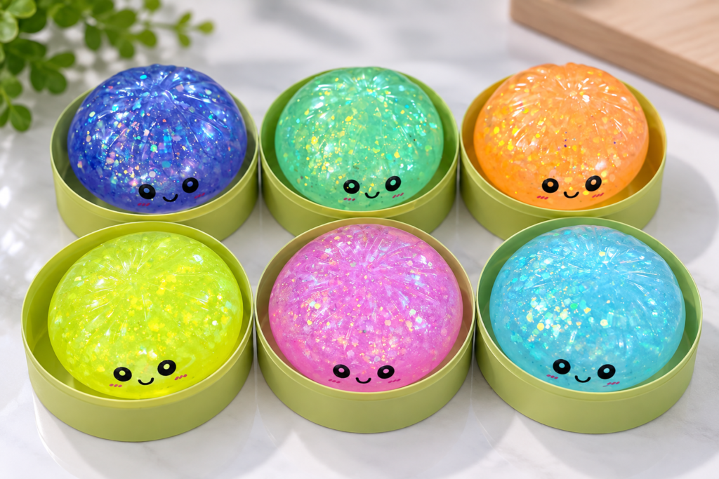
That is particularly noticeable in clear or semi-transparent squeeze toys.
A translucent blue toy may look pale near a thin edge and deeper through a thicker section. Add glitter or suspended decorative elements and the same product can look different again as it moves.
This is not necessarily a defect. It may be the entire reason the material was selected.
The important point is that custom toy colors should be evaluated on the actual intended material rather than approved only from a flat color reference.
This also means that a buyer developing several products in one collection should not assume that a color matched on one material will transfer perfectly to every other material in the line.
Finish Changes Color Without Changing the Pigment
Two parts can use a similar color and still look noticeably different because their surfaces handle light differently.
A glossy surface creates stronger reflections. A matte surface scatters light more softly. Mold texture, roughness and other surface characteristics can alter how bright, dark or saturated a color appears to the eye.
X-Rite describes color and surface texture as closely connected because gloss, roughness and reflectivity influence perceived appearance.
That makes finish part of the color decision.
Suppose a buyer approves a smooth glossy prototype, then the production version receives a softer matte texture. The underlying color formulation may be close, but the visual result can still feel different.
For that reason, a useful color approval should identify both the target color and the intended surface appearance.
Color + material + finish is a more complete specification than color alone.
Special Effects Need Their Own Approval
Glitter, pearlescent particles, metallic effects and transparent layers are even harder to communicate with one flat reference.
A pearlescent surface may shift as the viewing angle changes. Glitter can appear subtle in diffuse light and much stronger under direct lighting. A transparent colored skin can interact with the filling or internal elements beneath it.
With custom toy colors, these effects are part of the product appearance, not simply decoration added after the base color has been approved.
That is why approving a photograph can be particularly risky for effect finishes.
A photo freezes one combination of camera, lighting and viewing angle. The physical toy does not.
If the effect is important to the SKU, it should be judged on a physical sample that represents the intended material and finish.
Lighting Can Make Two Matching Samples Stop Matching
There is another reason color approvals can become confusing: the room itself.
A sample may look correct near a window and noticeably different under store lighting. Two materials can appear well matched under one light source but separate under another—a phenomenon known as metamerism.
For custom toy colors that are commercially important, especially signature brand colors or colors that must coordinate across several SKUs, it helps to evaluate samples under a consistent viewing condition.
A toy buyer does not necessarily need a laboratory for every ordinary color decision.
Consistency is the more important lesson.
If the buyer approves one sample in daylight, another under a warm desk lamp and a third from a phone photo, the approval standard keeps moving. Using the same viewing conditions and retaining the approved physical reference gives both sides something more reliable to compare against.
An Assortment Needs Relationships Between Colors
Imagine six fruit-shaped squeeze toys displayed together. Each color may look attractive on its own, yet the collection can still feel unbalanced if three colors are visually very similar while one dominates the entire display.
Buyers developing several custom toy colors should therefore review the assortment as a group.
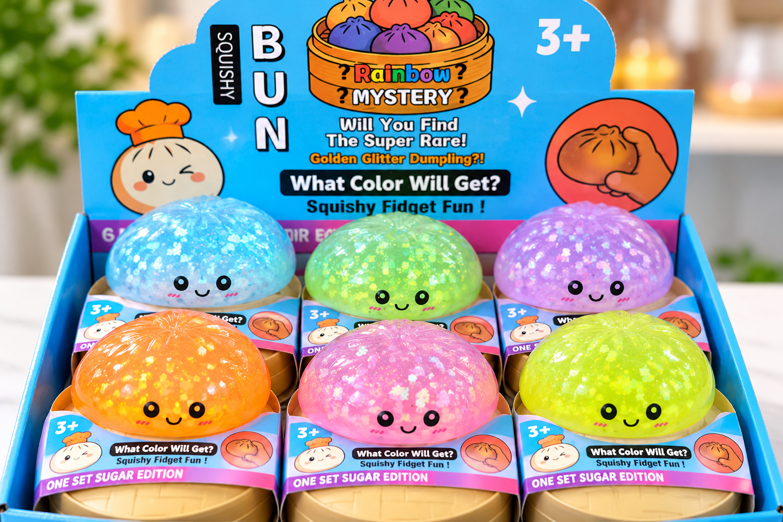
Does each variation read clearly from the others? Are the colors different enough for shoppers to recognize the choices? Does one fluorescent color overpower softer shades? If one design is intended to be a special or rare variation, does its finish actually make it look different?
This is especially useful when one product platform expands into multiple colors, seasonal editions or special-effect versions.
The question changes from “Is this blue correct?” to “What role does this blue play beside the other five colors?”
That is a merchandising decision as much as a manufacturing one.
Keep an Approved Physical Reference for Reorders
The first production run is not the end of color management.
A successful toy may be reordered months later. Raw materials, pigment batches and production conditions can vary, and the people reviewing the second order may not be the same people who approved the first.
That makes an approved physical sample useful beyond initial development.
Instead of telling a manufacturer that the new batch should look “like last time,” the buyer and supplier can compare against an agreed reference representing the accepted material, color and finish.
For critical programs, measurable color data can add another level of control. Not every novelty toy needs an elaborate numerical tolerance, however.
The approval method should match the importance of the color. A generic assortment color may allow reasonable production variation. A signature brand color used across a coordinated product line may justify much tighter control.
The buyer should know which situation applies before mass production begins.
Approve the Appearance, Not Just the Color Name
A useful custom toy colors specification does more than list Pantone references.
It connects the color to the material, identifies whether the appearance should be opaque or translucent, records the intended surface finish, and treats glitter or other visual effects as part of the approval rather than an afterthought.
For coordinated assortments, the colors should also be reviewed together. For important repeat programs, the approved physical reference should remain available when the next production run begins.
Pantone provides a shared language. The physical toy still determines how that language appears in the real world.
That is why the strongest approval question is not simply:
“Is this the right Pantone?”
It is:
“Does this finished material, surface and effect look like the product we intend to sell?”
Read More